
It’s not about buttons, it’s about people!
Having a user-friendly interface is no walk in the park, as Geoff Meads found out recently. Here, he stresses the importance of designing for the user, not the expert.
In previous columns I introduced the concept of User Experience (‘UX’) and described how, as an industry, we’re not yet that good at it. We’re masters of embracing technology and deploying it to complete complex tasks. We’ve become experts at working with other construction professionals and have developed standards and recommended practices for the design and deployment of integrated technologies. However, we often fall short when it comes to understanding the most fundamental success factor of an installation – the experience of the people that use it.
Tech Gets In The Way
As the world starts to open post-Covid we are, once again, able to get out, see friends and visit the wonderful places around us. My hometown is the university city of Cambridge, UK. Known for alumni such as Issac Newton and Stephen Hawking, Cambridge is also a city of fascinating history and many, many tourist attractions. This last weekend we got the chance to show a good friend of ours around the city and our starting point was the university’s Botanical gardens.
ADVERTISEMENT
Now I know what you’re thinking, what on earth has a trip to a local garden got to do with UX? Well, it’s often in these everyday activities that UX issues become incredibly clear and their fixes present themselves if you have an inquisitive mind.
On arriving at the entrance gate there was a short line and a kiosk taking the entrance fee. However, the nice people manning the kiosk couldn’t take actual money as cash is now avoided or not accepted at all for infection control reasons.
To gain access to the garden, while standing in the queue, we each had to go to the garden’s website, create an account (including clicking a confirm link in an email that duly arrived) then book tickets via the new account and pay by typing in all our card details. We then received another email with a booking number which the person in the kiosk checked before we could enter. It wasn’t good enough to show the payment confirmation page of the website, you needed to show the email receipt.
Now, in the venue’s defence, the system worked. We paid, no cash was passed between hands and we gained legitimate entry. The ‘system’ as designed and deployed fulfilled the design criteria. In addition, the venue gained our email address for future marketing (although this is of limited use due to GDPR legislation).
But let’s look at that transaction from the customer perspective.
Firstly, what if you don’t have a smart phone? Gardens are particularly attractive venues for older people and many either don’t have a smart phone or are not confident using it for online purchases. In addition, the website layout of the venue’s booking system had tiny text which many older people (and not so old) would have found very difficult to read, especially outside in sunlight.
Secondly, the time it took (even as a confident smart phone user) to complete the transaction was 15 minutes. That was time that we were missing in the venue, and we were getting in the way of other visitors queuing to get in.
Finally, the whole system led visitors to become understandably frustrated and the kiosk operative to be in line for several complaints about how ridiculous the system was. Getting ‘wound up’ by entrance procedures is hardly the best state of mind to be in when you’re entering an otherwise wonderful garden!
As a user (visitor) it was a poor experience by any measure. It took too long, led to several frustrations en route to completing the task and we’ll now think twice before returning.
The answer is so obvious, isn’t it?
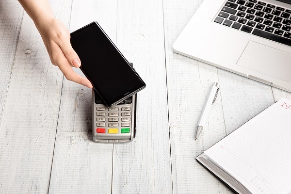
So how can this be fixed? Well, the answer is simple. Put in a contactless card machine. The whole transaction can be reduced to a few seconds and visitors will be in a far better mood when entering the garden. They will be more likely to revisit and / or recommend it to friends.
Ah, but what if there is no phone line at the kiosk for the card machine? Let’s pull out some easily available technology (a 4G router) for the card machine and we’ve solved that problem too. Afterall, if the 4G service at the kiosk is good enough for lots of visitors to complete the online transaction on a phone there must be plenty of service for a simple PDQ machine.
Why no fix then?
While I can’t answer that directly I have to believe that the venue simply doesn’t see the problem because they have never looked at it from the visitor’s perspective. It is in this realisation that we learn the biggest lesson of all – we are not the user of the systems we design so we cannot judge how well our designs work.
Where do we go from here?
There is a clear way forward from this discovery and that route is called ‘user testing’. It can take many forms and be deployed in many ways. While there is no one way that will yield perfect results every time there is one thing we can do right away to get much more relevant and useful feedback on our designs and that is to gain feedback from real, representative users.
The simple fact is that, as designers, technicians, and engineers we know too much. We know how the system works because we designed it to work that way. We make assumptions and use engrained knowledge that real users simply do not have and that makes our opinions of system functions invalid. It is like carrying out an experiment where you already know the results because you engineered the experiment to deliver those results. In reality, we need to design experiments that can lead to unbiased results. When we do that, we end up with results that are both valid and useful and systems that work for real users.
In future articles we will explore how to build useful testing schemes that deliver useful results. In the meantime, why not look around you and start to think about ways in which you might improve the experience of the shops, products etc. that you encounter? It is a revealing exercise and will give you incredible insight into the science we call ‘User Experience’.
-
ADVERTISEMENT
-
ADVERTISEMENT
-
ADVERTISEMENT
-
ADVERTISEMENT