
Finding the right-sized screen
If you have ever stood on a railway platform and looked across the tracks at a billboard-sized advertisement on the opposite wall, then you have an idea of what it means to see content that is designed to be viewed from a distance. The text is large enough to be legible, the images are big enough to be identifiable and, while physically large, it is far enough away that the entire sign is visible at once. To step up to the big screen experience, simply turn around and stand in front of the large ad on your own side of the tracks.
You will probably find that being so immersed in advertising makes it impossible to take in all of the information on this board as quickly as you could with the other. While large enough to command the entirety of your vision, you are only able to process a fraction of what is being taken in at any given moment. The rest is in your peripheral vision and while still a part of what you see, it does not contribute significantly to what you comprehend. Assuming you are moving your eyes as you read even this text, it should be fairly easy to confirm that this is true.
Should that huge image on the wall become a display with moving video, or graphics with several lines of text, it would quickly become tiresome and ultimately impossible to understand all of what is being shown as you move both your head and your eyes to keep the important parts of the screen in the more useful center of your vision rather than the periphery. This is to say nothing of the angular distortions and the insufficient resolution of the images that would further impede your ability to digest what is being served.
ADVERTISEMENT
Because of this, it is inadvisable to specify a screen that would be too big for the intended viewing distance. The absolute dimensions are not at issue here but it is the viewer’s proximity to the screen that makes all the difference. Just as it is possible to make a coin appear to be the same size as the moon by bringing the coin closer to your eyes, it is practically trivial that a fifty inch screen is actually smaller than a sixty foot billboard so long as you are a certain distance from both.
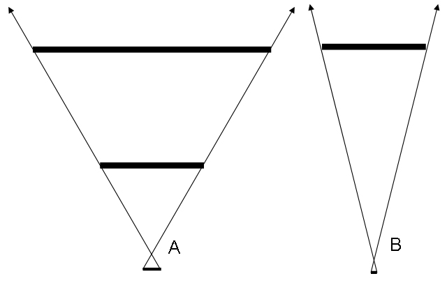
Figure 1 is an approximation of this phenomenon. From the top, the three horizontal lines in Part A represent a large object, a smaller object and the bottom line shows the amount of area on the viewer’s retina those objects occupy. This retinal area is commonly discussed in terms of angular degrees and it is the case that when the angular distance from one side to the other on two objects is the same, even if they really are different sizes, they will use the same amount of the retina. In terms of the moon and coin example, the small coin can eclipse the much larger moon so long as the angular size of the coin is the same or greater than the moon’s.
Of course, there are a number of other visual cues which indicate that one object is actually smaller than the other, regardless of what else is going on in your eyes but this can be manipulated to some extent as well. This specific application of perspective is not necessarily within the scope of this document but through some Escher-esque engineering, it should be possible to use the perception of scale to create the effect of a drive-in theater in one’s own home using models of various scales.
Returning to the illustration, Part B uses a similar concept to A but now the smaller item has moved away from the eye to the space where the larger object was positioned. This results in a narrowing of the angle between the left and right edges and causes the object to appear smaller than it did before.
When it comes to small screens, probably the smallest and most common of these is the one on your cell phone. It is smaller than any projection screen you are likely ever going to see but it is still legible and, therefore, able to serve a useful purpose. The reason for this is, again, the distance between the screen and the viewer and the resultant angular size. Rarely will the screen ever be more than an arm’s length away and keeping it close enough to be visible should not be difficult. As an added benefit, the number of people looking at the screen will almost always be one.
Under these conditions, it is fairly simple to justify using a very small screen but that all changes once you begin to introduce additional people to the audience. What still may be a perfect image for the one person in the one ideal position will be useless to everyone else from their varying distances and viewing angles. The options at this point are to give each individual their own screen, which is a great choice for certain venues, or provide one big screen that everyone in the room can see clearly. This is typically a far more efficient method.
Of course, now the problem is to define what size is small enough and large enough to be quickly and comfortably understood. We know that the distance between the viewer and the screen is important but we need to find the actual limits between size and distance.
Both Kim Milliken and Blake Brubaker have written comprehensively on the mathematics behind this relationship, and I would direct you to Sizing in Angles of View and Too Close for Comfort? in Angles of Reflection for the precise details. To summarize the results of their trigonometry, the closest audience member should be around 1.5 times the height of the screen and the most distant should be within around 6 screen heights for comfortable reading and viewing. Seating the last row a bit closer (4x height) may be necessary for some applications where finely detailed images must be inspected. For entertainment, it can be a matter of personal preference where the best seats will be located but these rules remain valid guidelines.
To get an idea of your own personal preferences, be prepared to estimate how large various screens appear by measuring them against something you always carry with you. For me, that means holding up one hand with thumb and pinky finger extended vertically as much as possible and held at arm’s length to check a screen’s relative height. It’s not a perfect system but comparing the size of the screen to my own hand lets me keep an accurate enough idea of what looks good without much effort. Conversely, holding your arm out as though weakly attempting to greet some invisible surfer may make you look somewhat foolish, so please find a system that you are comfortable using.
Once we have figured out how large or small the screen should be based on the distances from which it will be viewed, the next thing to consider is the size of the content that will fill that screen and the resolution at which it will be displayed. The same rules of angular size apply in this case but the particular angles will be quite different.
Figure 2 illustrates the rule we use for determining font height. The minimum legible size of text described by Milliken is such that the smallest character subtends no less than 10 arc minutes of a degree. This is the same as saying 1/6° and although the above chart is not at all to scale, it does show how the font size must change at a fixed rate with the distance from the viewer in order to maintain a constant size on the retina. Allowing ¼” in character height for every 7″ of viewing distance is a fairly accurate ratio which will ensure that virtually anyone will be able to read what is on the screen.
Beyond this rule, any size at any distance can be determined by considering the distance from the viewer to the screen as one leg of a triangle and the height of each character as the other leg. Given that the tangent of an angle is equal to the length of the leg opposite to that angle divided by the adjacent leg, minimum character height can be found through: tan(1/6°) * Distance. The maximum distance for a given character height results from Height / tan(1/6°).
Please note that this angle is given in degrees and must be used in radians for the equation to work. Conversion to radians is accomplished by multiplying the number of degrees by pi and dividing by 180. For the sake of simplicity, the usable tangent of 1/6° is roughly 0.00291. Thus, seven feet (84 inches) times 0.00291 is equal to 0.244 inches, or in practical terms, one quarter of an inch. For metric, consider using 3mm for every 1m.
The actual point size of the font used will be dependant on the resolution of the display. This information is usually given as the number of pixels that make up the width of the screen and the number of pixels that compose the height. The current standards for televisions are 480, 720, and 1080 pixel heights. Common computer resolutions have been along the lines of 640×480 or 1280×800, both of which denote the screen width and height in pixels.
An increase in resolution essentially means that the height and width of the screen is divided into more pixels. If the dimensions of the screen remain constant, then each pixel must be reduced in size to accomplish this. This is why we have been discussing font height in terms of actual linear height instead of the number of pixels or points from which it is comprised. A 12pt font might work for the printed page but on a high resolution screen it may need to be 24pt to remain legible from similar distances.
To estimate the size of a pixel in a given display, simply divide the linear length of one dimension by the number of pixels in that same dimension. A screen that is conveniently 4.8m high and with a vertical resolution of 480 will have pixels that are around 1cm tall. There is some distance, or pitch, between each pixel and this is the reason why we cannot assume the pixel to be exactly one centimeter high. Fortunately, for the purposes of determining font legibility, it is generally safe to ignore the pitch.
The maximum character height for a 12pt font on this screen would be around 12cm high, and would, therefore, be visible from about 40m away (1m distance for every 3mm character height). We are more interested in the minimum character height to determine the threshold of legibility however, and this is going to be somewhat less than 12cm. Exactly how much less is dependant on the individual font. Suffice it to say, sizing the font a few points higher than what would be needed for maximum height will probably be in order.
I have found through experimentation that the short lowercase letters in some common fonts will be about 60% the height of the uppercase letters. This means that “X” is about 1.66 times taller than “X” and so if you can determine the minimum character height and the number of pixels it would take to render that character, multiplying by 1.66 should let you know roughly what size font to actually select. In this example, a 20pt font will yield characters no less than 12cm high.
To tie everything together, assuming this 4.8m screen at 640×480 pixels, the first row of seating should be 7.2m back (4.8m*1.5) and the last row will be within 6 screen heights, or 28.8m. Multiplying this distance by 3 will give us 86.4, the minimum legible font size in millimeters. Since dividing the screen height by the number of pixels in the vertical resolution gives us 1cm per pixel, the smallest character will be 8.64 pixels high. Multiplying this by 1.66 lets us know that we need a font at least 14pts to be seen by the back row. Imperial measurements will work the same way, with the exception of using ¼” character height for 7″ distance.
By using these rules together in this way will help ensure that the screen and everything on it is able to be understood by anyone in the room, regardless of their point of view.
-
ADVERTISEMENT
-
ADVERTISEMENT
-
ADVERTISEMENT
-
ADVERTISEMENT